Entertainmenttheatre & artsArt Exhibitions
A Pop-Up Book Chronicles the History of Typography.
SO
Sophia King
5 hours ago7 min read5 comments
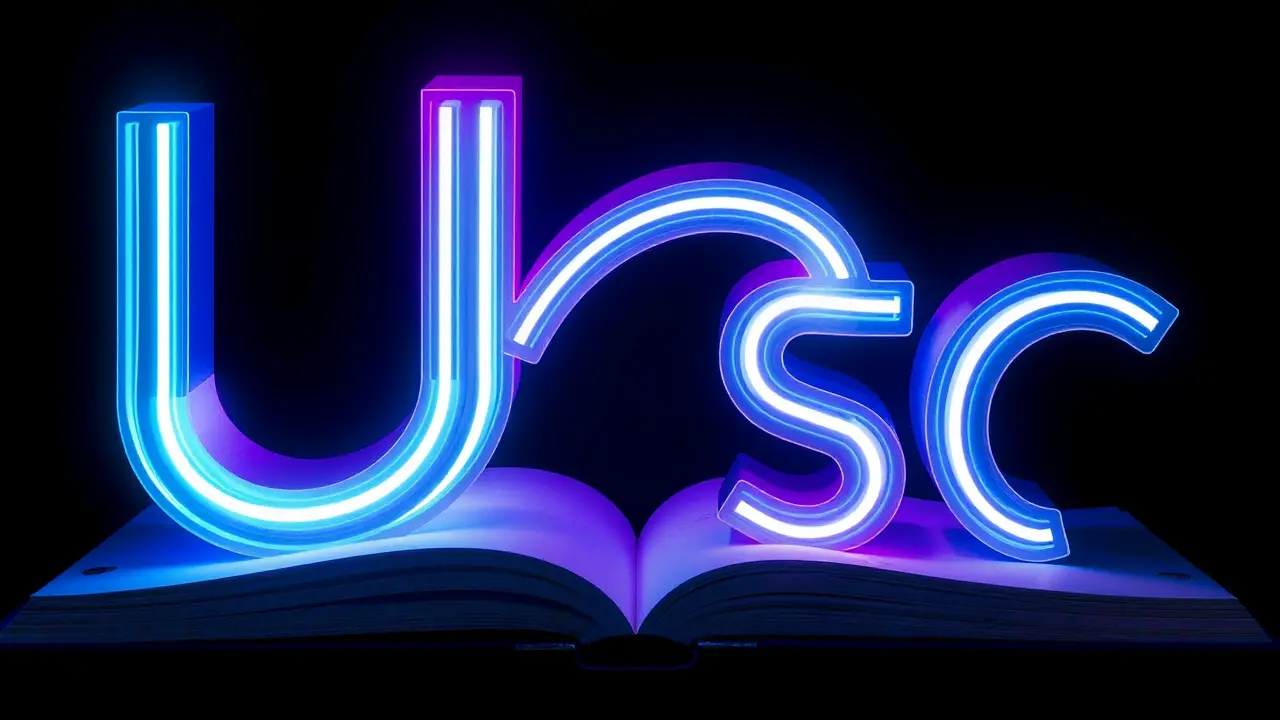
Ever paused to wonder why the letter 'A' looks the way it does, or what gives those wavy, psychedelic fonts their unmistakable 1960s vibe? These are the very questions that graphic artist and papercraft virtuoso Kelli Anderson explores in her breathtaking new pop-up book, *Alphabet in Motion*, a project that transforms the dense history of typography into an interactive, tactile journey. Anderson, whose previous work includes the ingenious *This Book is a Camera*, has spent the last six years meticulously crafting this two-volume set, which comprises a two-inch-thick pop-up book featuring 17 hand-designed mechanisms and a companion 120-page essay volume.This isn't merely a history lesson; it's an experiential dive into how human ingenuity has shaped written communication, from the chiseled stone of ancient Egypt to the digital projections of the modern era. Anderson’s process was as much an archaeological dig as it was an artistic endeavor, involving deep dives into historical collections at institutions like London’s St.Bride Foundation and thousands of hours experimenting with paper engineering to ensure each pop-up—from light projectors to colorful sliders—didn’t just dazzle but demonstrated a core typographic concept. For instance, her exploration of the letter 'J' reveals how the advent of phototypesetting in the early 1960s, a technology that replaced molten lead with light projected through film, unleashed a wave of creative experimentation.This breakthrough allowed designers to warp and bend type in ways that mirrored the psychedelic light shows of Andy Warhol’s Exploding Plastic Inevitable, effectively tying typographic evolution directly to cultural shifts. One of the book’s most engaging features is a paper projector pop-up that lets readers use their iPhone flashlights to create their own '60s-style light shows, making abstract historical processes tangibly accessible.Other interactive elements include a 3D model explaining the Roman development of uppercase letters, a mini-pop-up on the creation of bitmap fonts for early video games, and a mechanism that traces the word 'text' back to the practice of weaving, illustrating how craft influenced language itself. Anderson’s work stands at the intersection of art, design, and technology, serving as a bridge that connects seemingly niche typographic details to broader cultural narratives.She hopes the book will not only captivate children with its visual splendor but also inspire a future generation to see design as deeply intertwined with human history and expression, much like how a well-crafted UI in a modern app feels intuitive because of centuries of typographic refinement. By making the history of letters something you can physically manipulate and play with, *Alphabet in Motion* does more than inform—it ignites a creative spark, proving that the shapes we read every day are artifacts of human innovation, waiting to be unfolded and understood.
#editorial picks news
#typography
#pop-up book
#graphic design
#Kelli Anderson
#Alphabet in Motion
#history of letters
Stay Informed. Act Smarter.
Get weekly highlights, major headlines, and expert insights — then put your knowledge to work in our live prediction markets.
© 2025 Outpoll Service LTD. All rights reserved.