Entertainmentculture & trendsFashion and Style
Fast Company Features Elegant Porte Neue Typeface in Design
SO
Sophia King
4 hours ago7 min read
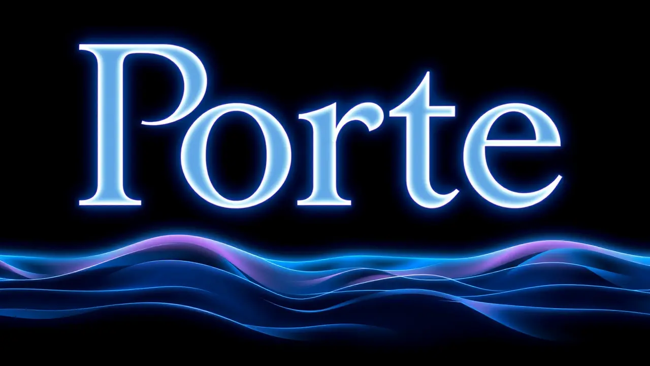
In the meticulously curated visual landscape of modern media, the choice of a typeface is never merely a utilitarian decision; it is a profound design declaration, a silent ambassador for the content it frames. The recent feature of the Porte Neue typeface by Fast Company’s design team is a masterclass in this very principle, a selection that speaks to an era where typography is not just read but felt, an aesthetic tool as crucial as any color palette or layout grid.Porte Neue, with its effortlessly sophisticated curves and impeccably balanced letterforms, embodies a design ethos that prioritizes clarity without coldness, elegance without arrogance. Its adoption by a publication synonymous with cutting-edge business and innovation is a signal, a quiet nod to the growing demand for digital and print experiences that are not only informative but also intrinsically beautiful, that respect the reader’s eye and cognitive load.This isn't a fleeting trend pulled from a template; it’s a deliberate curation, reminiscent of how a painter selects the perfect brushstroke or a sculptor the ideal chisel. One can almost visualize the design team's process—a wall of digital mockups, endless A/B testing on reader engagement, and the final, decisive moment when Porte Neue emerged as the clear victor, its serene authority elevating the text from mere information to an object of quiet contemplation.The typeface itself, likely born from countless hours of refinement by its creators, functions like a perfectly designed user interface for language; it doesn't shout for attention but rather creates a seamless conduit for ideas, its subtle idiosyncrasies and humanist touches providing a warmth that stark, geometric sans-serifs often lack. This move by Fast Company reflects a broader, thrilling convergence in the creative industries, where artificial intelligence tools for generative design and layout are becoming collaborators, yet the final, human-centric judgment on feel and emotional resonance—the choice of a typeface like Porte Neue—remains the irreplaceable heart of the process.It’s the typographic equivalent of a perfectly composed photograph, where every element is in harmony, guiding the viewer effortlessly through the narrative. By championing such a refined and sophisticated typeface, the publication isn't just formatting an article; it is making a statement about the value of design integrity, arguing that in a world saturated with visual noise, the most powerful message is often delivered not with a bang, but with a whisper of impeccable taste.
#featured
#typeface
#design
#Porte Neue
#Fast Company
#typography
#elegance
#editorial design
Stay Informed. Act Smarter.
Get weekly highlights, major headlines, and expert insights — then put your knowledge to work in our live prediction markets.
© 2025 Outpoll Service LTD. All rights reserved.