Otherauto & mobilityElectric Vehicles
The Google Sans Flex typeface is now available to download
SO
Sophia King
2 hours ago7 min read
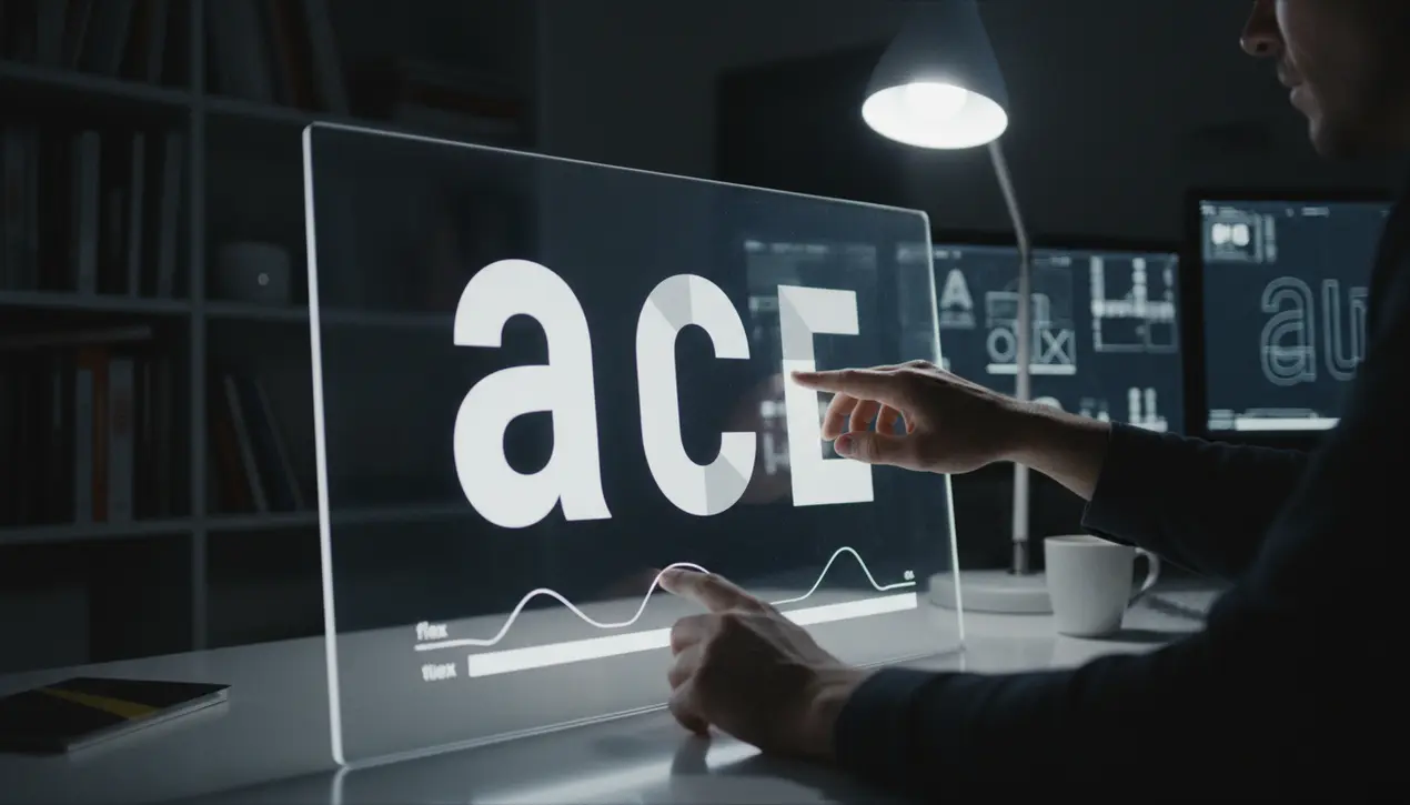
For the design-obsessed and typographically curious, a new tool has just landed that feels less like a font release and more like unlocking a creative superpower. Google has officially released its Google Sans Flex typeface to the public, offering it as a free download and effectively handing over a core piece of its visual identity.This isn't just another font added to the library; it's the next generation of Google's brand typeface, a variable sans-serif that serves as a foundational element of its Material 3 design language which began its rollout in 2023. As a UX designer who lives in the space where aesthetics meet functionality, this move is profoundly significant.Variable fonts represent a tectonic shift in digital design, moving us away from the static, rigid typefaces of the past and into a fluid, responsive future. Google Sans Flex, with its underlying OpenType Font Variations standard, is a masterclass in this new paradigm.As Google designer Casey Henry eloquently put it, the font allows letterforms to 'shape-shift at different scales. ' Imagine a single font file that can elegantly morph from a delicate, refined weight for body text on a desktop display to a robust, condensed version for a smartwatch notification, all without losing its essential character or requiring multiple file loads that slow down user experience.This fluidity is the holy grail for creating seamless, adaptive interfaces across the vast ecosystem of devices and screen sizes we interact with daily. The design community, particularly on platforms like Reddit, is already diving into the nuances with the excitement of artists discovering a new medium.One keen observer noted that when you condense the width, the circles within the font don't simply compress into ovals; they transform into more rectangular forms with rounded tops and bottoms, a subtle nod to the utilitarian brilliance of classics like DIN 1451. This level of intelligent, dynamic design thinking is what separates a mere typeface from a comprehensive design system.For creators using tools like Figma, this release is akin to being given a new, more intuitive brush. It empowers us to build interfaces that are not only visually cohesive but inherently more accessible and performant.The ability to fine-tune weight, width, and optical size with infinite granularity from a single file means we can achieve a typographic hierarchy that feels organic and precisely tuned to its context, much like how a skilled painter uses a single pigment to create an entire spectrum of tones. This open-sourcing of a cornerstone corporate asset signals a broader, more collaborative approach to design infrastructure, inviting a global community of developers and designers to build upon and integrate this fluid language into their own work, potentially elevating the entire digital landscape's aesthetic and functional consistency. It’s a bold stroke on the canvas of the web, and its ripple effects will be felt in every app, website, and operating system that dares to embrace its flexible potential.
#Google Sans Flex
#typeface
#font
#Material 3
#variable font
#download
#design
#featured
Stay Informed. Act Smarter.
Get weekly highlights, major headlines, and expert insights — then put your knowledge to work in our live prediction markets.
Comments
Loading comments...
© 2025 Outpoll Service LTD. All rights reserved.